


A few months ago, in the gap between two long-term projects, I finally had time to build something I’d been thinking about for a while, together with two teammates, Iulian Holonca and Marian Naslau. It lives in your Jira backlog, it’s currently at MVP stage, and it’s a good example of what happens when project ideas that come from the bottom up are encouraged at the management level. Here’s the story, and an invitation for you to try it.
The origin story
I’d been working for years in Jira and Azure DevOps, on large backlogs, and kept running into the same wall: you can view a backlog as a list, a table, or a board of cards, but none of these views make it easy to see the whole picture at once. The relationship between a parent item and its children, and the actual effort behind a chunk of the project, stay hidden until you go digging.
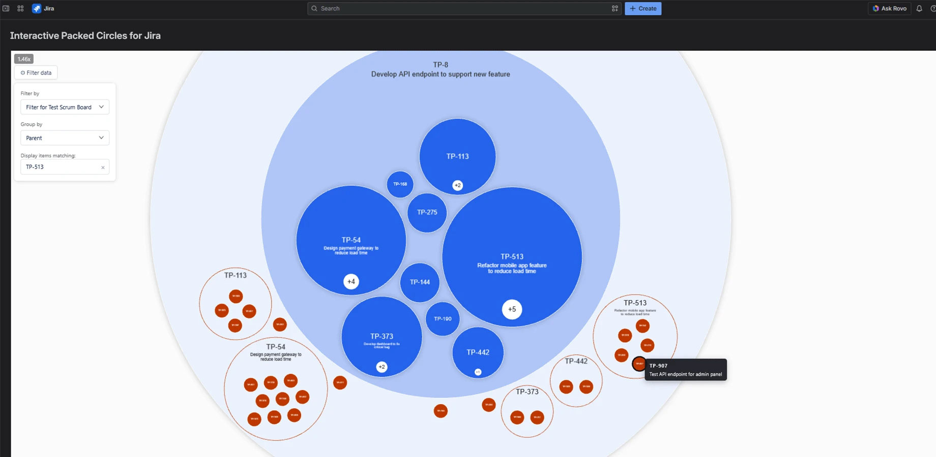
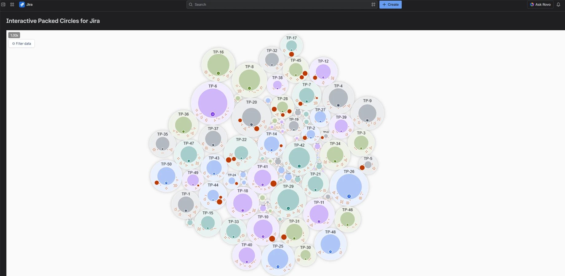
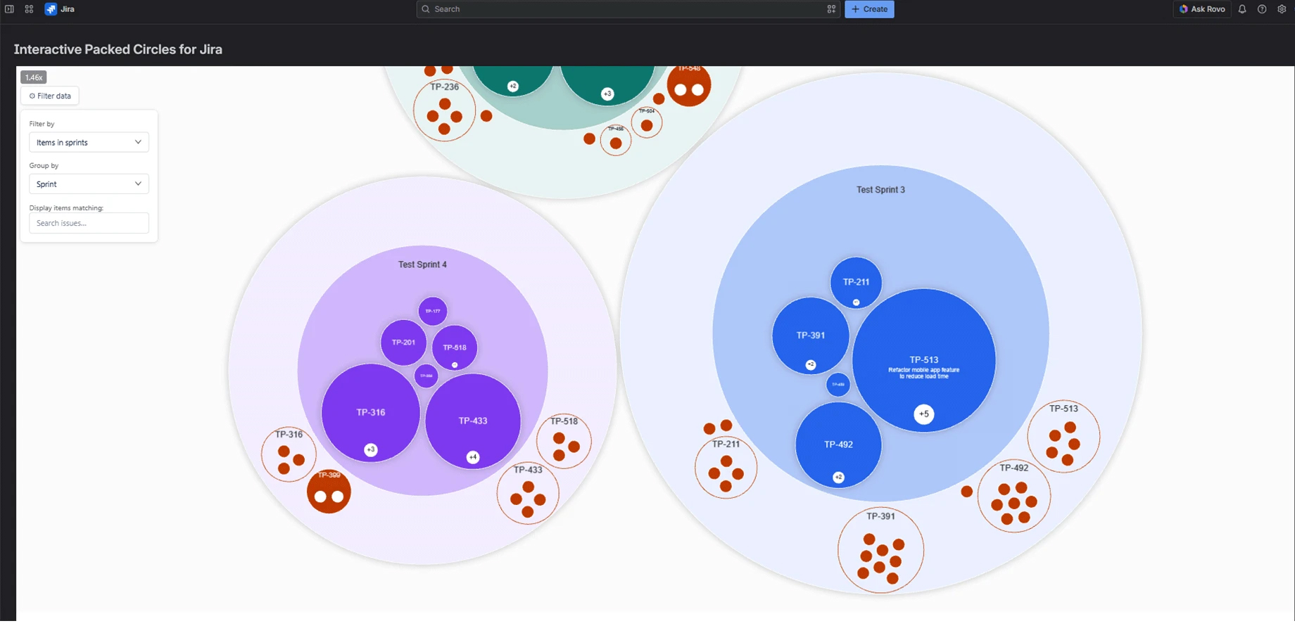
Thinking about this, I sketched out what I’d actually want to see: a packed circle chart, where every work item is a circle, and child items sit nested inside their parent, as deep as the hierarchy goes. Circle size maps to effort, and the size of the gap between two items is visible at a glance. Further, you can generate the chart by hierarchy or by sprint, open a work item straight from the chart, edit it, and watch the chart update immediately, without leaving the view.
The idea had been sitting with me for a while. I only had time to actually build it once work on my latest long-term engagement wrapped up. I brought in Iulian and Marian for development, while I drove the idea and the functionality side.
With a little help from the brass
I presented the idea to upper management at RomSoft, looking for some guidance on administrative issues. They were open to backing the project, bringing in a designer, offering mentorship, and running the idea past other colleagues for feedback. For a few weeks, other colleagues stepped in, in their free time, to bring their contribution – whether to set up some communication objectives, an Atlassian vendor account, or even a bank account. No conditions were attached around IP or exclusivity – we’re free to decide where this goes.
Marginal note: That’s the part where I’d encourage anyone else at RomSoft sitting on a side idea to come clean about it. Support may not come in the form of a blank check. But you may get some good advice, and even concrete resources, to save yourself some inherent red tape frustration.
How we worked
Neither I nor Marian had recently worked on interactive front-end. I came from a backend and infrastructure background, while Marian had web experience but not this kind of interactivity. We rebuilt parts of it more than once, including after some AI-generated code turned out too convoluted to maintain. Iulian’s side, wiring up the Jira integration, went more smoothly.
There’s still some refining to do, both on the functionality and on the performance side, since the initial load after applying a filter still takes a moment.
What you can do with it today
The app targets Agile teams, and specifically people in coordination roles – Business Analysts, Product Owners, Product Managers – who need to read a backlog fast. You display the results of your saved Jira filters and group them by hierarchy, assignee, or sprint, which makes it easier to spot who’s overloaded without re-filtering the board every time.
Navigation works like a map, with zoom in and out, and semantic zoom that shows more or less detail depending on how far you’ve zoomed. You can see estimated versus unestimated work at a glance – useful when you’re heading into a refinement session with your team and when you’re presenting effort to a manager. Circle size does the translation for you instead of making your audience convert story points in their heads.
What’s next
At this stage, we’re after a specific kind of feedback: which features actually get used, what’s missing, what would make someone who works in Jira everyday reach for this over their usual view.
There are still a few things on our roadmap, too: filtering closer to native Jira filters, more ways to save dashboards, drag-and-drop to reassign parent-child relationships, and sizing circles by any numeric field instead of just story points, so a monetary value or any other number tied to a work item can drive the chart too.
Try it
The app currently goes by a working name, Interactive Packed Circles Chart for Jira – search for it on the Atlassian Marketplace after spinning up a free Jira instance. It’s free for teams of up to 10 users, deliberately, since the goal right now is to reach out and collect feedback.
If you work with a Jira backlog large enough to lose track of, give it a try, and if you know someone in the local tech community who does too, send them this way. Iulian, Marian, and I will be the first ones to tell you that marketing is the part we’re least sure about – and a recommendation from someone who actually operates in Jira every day counts more right now than almost any other type of input.